

Business: Baltic Bread
Location: 200 Gibson Avenue, North of Barton Street East
Neighbourhood: Gibson/Barton Village
Sign Type: wall sign
Baltic Bread is a charming little bakery whose compact facade drew my attention as I passed by one dreary day-- the sign was actually more of an afterthought. According to the bakery's website, they've been making authentic European breads for over half a century.
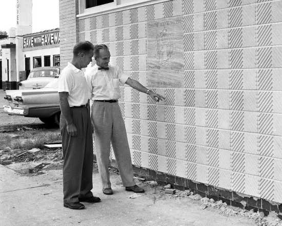
After some quick online research, I learned that this tile exterior can be dated roughly to the late 1950s, when tiles in arrangements of alternating solid colour, checks and/or stripes were in fashion for both architectural exteriors and interiors (a couple of examples of this can be found here and here). The sage green tiles with smaller hits of checkerboard pattern throughout remind me a bit of textile patterns from the same period. It's likely that the use of smaller and more detailed tilework in the 1950s was an outgrowth of the use of larger Vitrolite tiles in the 30s and 40s.
The cursive font used on the bakery's sign reminds me of a part in the movie Helvetica where the font was deemed a revolutionary move away from the ubiquitous use of cursive script in advertising and design in the 40s and 50s. I believe they may have even disparagingly described such fonts as being feminine, or design conventions of the time as being highly feminized. I appreciate the use of cursive script in this sign and the whimsy of the 'i' dotted with a star. There is also something very of-the-time stylistically about having Crusty Rolls appear in single quotation marks-- not something you see very often today. This entire storefront and sign can be seen as a time capsule of subtle 1950s design conventions. Feminized or not, I am not ashamed to say that I love the buoyant (and sometimes downright pretty) design of this period.
The cursive font used on the bakery's sign reminds me of a part in the movie Helvetica where the font was deemed a revolutionary move away from the ubiquitous use of cursive script in advertising and design in the 40s and 50s. I believe they may have even disparagingly described such fonts as being feminine, or design conventions of the time as being highly feminized. I appreciate the use of cursive script in this sign and the whimsy of the 'i' dotted with a star. There is also something very of-the-time stylistically about having Crusty Rolls appear in single quotation marks-- not something you see very often today. This entire storefront and sign can be seen as a time capsule of subtle 1950s design conventions. Feminized or not, I am not ashamed to say that I love the buoyant (and sometimes downright pretty) design of this period.
No comments:
Post a Comment